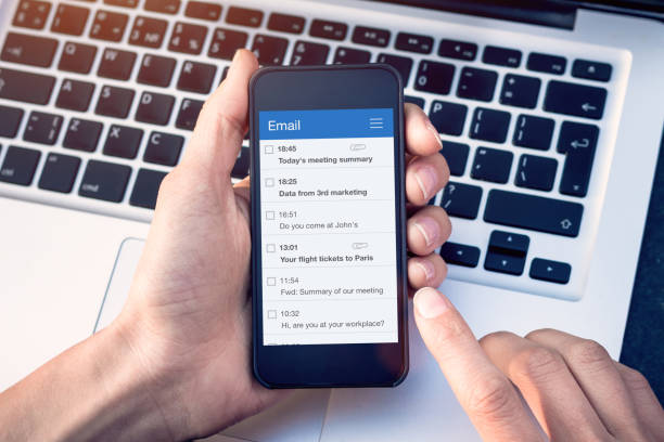
If your campaigns are not mobile-friendly, then you are behind the times. People are more likely to open emails on their mobile phones than on a traditional computer or laptop. Therefore, it is vital that any email campaign is created to operate on a mobile. Modern thinking is to create the campaign for mobiles first and then adapt for other devices. Due to the speed at which mobile technology has taken off, companies must get their campaigns right first go or risk falling behind the competition. Here are 10 top tips on how to get your campaign ready for mobile devices.
Top Tip 1: Single columns
Smart phones re designed to be used in portrait mode. Creating single column documents makes them easy to access by scrolling up and down. Multiple columns are fine for other devices such as computers as their screens are more useable in landscape mode. Users do not want to scroll side to side and up and down on their mobile – they will simply close the email.
Top Tip 2: Less is more
This may seem like a bit of common sense, but it is something that can be easily overlooked. Mobile screens are smaller than other devices so screen space is at a premium. Use the space wisely and get straight to the point. Pictures are more valuable than a chunk of text with mobile friendly emails.
Top Tip 3: 40 characters or less
A challenge but one that must be met. The subject line of your email needs to be 40 characters or less. Remember that mobile screens are small so long subject lines won’t be entirely visible and will mean the user has to try and scroll across. Get creative and cut the characters down.
Top Tip 4: Larger fonts
This sounds like the wrong thing to do but making the font larger does matter with mobile-friendly campaigns.
Small text on a small screen is a massive turn off and is a guaranteed way to lose a potential client.
Top Tip 5: Clear links
When adding links for the user to navigate through it is important to space them out as much as possible. Links which are stacked close together make it possible to click the wrong link. Although clicking back isn’t a huge problem, it is inconvenient to the user.
Top Tip 6: Don’t rely on images
Yes, images play a huge part in a campaign and can get your message across much quicker than reading some text. However, some images fail to load or take so long to load that the email gets closed. Your email must make sense without the image otherwise your efforts have been wasted.
Top Tip 7: How many megabytes!
This is linked to the size of the email. An email full of images and videos will be large in terms of file size. This makes it slow to open and is more likely to not be viewed by the user you have targeted. Aim of 1 megabyte maximum to make sure the email is easily opened on a mobile device.
Top Tip 8: Call to action
The whole purpose of an email campaign is to get the user to do something – a call to action. This could be accessing your website, purchase something or enrol onto a course. What ever it is, a button to do this must be prominent and easy to find. This is what the user will be looking for so make it easy for them.
Top Tip 9: Images are images and buttons are buttons
Images are great when used well and convey your message clearly. Therefore, you must use images as an image and not combine them with a call-to-action button. Keep these very separate so as not to confuse your user.
Top Tip 10: Analyse results
Moving forward successfully with future campaigns is dependant on your analysis. Which mobile devices were used the most? How much engagement was there when comparing iOS to android? Knowing this means your future campaigns will be more successful and you will know which formats to target in a different way.
Sara Sparrow is a marketing writer at Custom essay writing service.


