Over the last few decades, technology has evolved at a rapid pace. The world is now dominated by digital experiences and smartphone users are increasing worldwide day-by-day.
It’s clear that UI design is here to stay. Designers are finding innovative ways to create beautiful user interfaces that are easy to use for everyone. Now, the question arises what will happen in 2022?
The term “user interface” (UI) describes any design in which humans interact with machines. The way people interact with computers is rapidly changing, so it’s no surprise that leading UI design trends have changed drastically in the past few decades. From physical buttons to touchscreens and voice activation, UIs have evolved a lot since their early days.
As smartphones become ubiquitous, web design is changing to adapt to smaller screens. Major changes are taking place in the world of user experience (UX) and user interface (UI). Web designers are following guidelines that encourage a mobile-first approach for Internet browsing. The current generation web apps demand special design touches for better performance. Mobile devices have created completely new ways of downloading and sharing content between individuals. Let’s look at some interesting trends in UI/UX designing industry likely to gain popularity in 2022.
Here are six user interface design trends that will gain even more popularity over the next five years:
1. Dark interfaces will rule the world
Dark interfaces [or dark UIs) are becoming extremely popular because they look good and also increase productivity by lowering distraction and improving focus through darkness and color contrast (concentration!). The dark UI is especially effective for web and mobile apps because they are used outside in bright light, so designing them to reduce distraction really helps. This concept has been around for a while but it’s recently become extremely popular, so expect this trend to stick with us until 2022 (and beyond).
UX designers claim that black interface elements are easier to focus on compared to grey or white ones which is why dark UIs became so popular in recent years (especially among mobile apps). The interface should display the necessary content only, while all other elements should remain hidden unless they’re needed. This way your users won’t be distracted by unnecessary things like cluttered menus or pop-ups that block the content they want to see. Mobile app icons are also trending to become darker, as it helps them stand out against light backgrounds.
2. Mobile-first approach
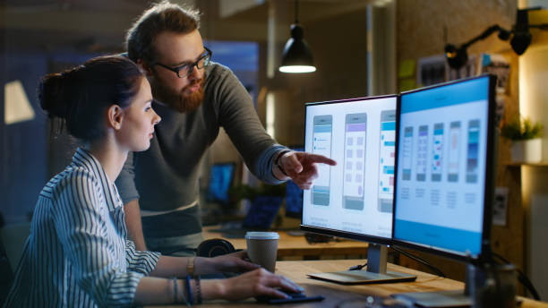
Designing an app or website always starts with creating wireframes of the most important views, then adding more views that aren’t crucial later on when you can afford to spend time on them. The problem with this process is that after the most important screens are done, you often end up needing to make changes to them if they don’t fit well visually (or functionally) with all other screens in your app/website.
In order to prevent this from happening, you can create all of your screens at once and then attach them together. The advantage of the mobile-first approach is that it brings a lot more consistency throughout your app/website, as all screens are created for the same device size. It’s also easier to maintain your wireframes if they have the same visual structure as an actual product made with Sketch or Illustrator (if you use those).
This is a great way to make sure that everything works as it should on small screens, without having to worry about later adjustments for larger displays. Mobile-first design is especially popular among eCommerce websites and apps, as they need to be usable on a variety of screen sizes.
3. Voice User Interface (VUI)
Voice user interfaces have been gaining a lot of traction over the past few years and we expect it to become a leading UI interface design trend within 5 years from now. There are already some big companies that have been into voice UIs, Amazon being one of them. Having a voice UI doesn’t necessarily mean you have to use it only for the sake of having a voice interface. The reason why we think it will be a leading UI design trend is that still today, not all devices are equipped with touch screens and people prefer using keyboards over touch screens for typing things. Voice UIs can be used as an alternative to touch interfaces or even keyboards in some cases.
As we become more reliant on our devices, we need them to be faster and easier to use. The best way to achieve this is through voice commands, which allow us to operate our technology with just a few words. This is why VUI is becoming more and more popular, as it eliminates the need to use a keyboard or mouse. All you have to do is speak into your device and it will respond accordingly.
4 . Simplification
A big trend in UI design at the moment is simplification – making interfaces as easy to use as possible, with as few distractions as possible. This is particularly important on mobile devices, where screen space is limited and users are often doing other things at the same time (e.g. checking their email or texting while watching a movie). In order to meet this challenge, designers are focusing on creating clean, simple interfaces that are easy to navigate and don’t require too much input from the user.
Simplification is another key trend in UI design at the moment. With much information available online, users are becoming more and more overwhelmed with content. Therefore, as a UI designer, your job is to simplify the user experience as much as possible; removing unnecessary information and focusing on what’s truly important.
5 . Immersive 3D visuals
When talking about user interfaces it’s always hard not to mention gaming because modern games are becoming very visually immersive. A lot of designs nowadays try to imitate this immersive, realistic approach that gaming has introduced us to. It could be either realistic 3D models or splashy animations that look good but aren’t really functional for users. We believe this “somewhere between” approach where you use modern tools available without sacrificing usability is the future of UI design.
3D visuals are becoming more and popular in UI design, as they offer a more immersive experience for users. This is particularly evident in gaming apps and websites, where 3D graphics can create an illusion of depth that makes the user feel like they’re really there. As 3D technology becomes more widespread, we can expect to see more 3D visuals in UI design, especially in apps and websites that require a high level of immersion (e.g. virtual reality).
6. Split-screen design
Another trend that is slowly gaining popularity is split-screen design. This trend is often used on mobile devices where there’s not enough space to show everything on one screen. It splits the screen into two or more parts and allows users to interact with each part separately. We believe this type of interaction will become more popular in the near future because it’s very user-friendly and allows users to multitask more efficiently.
Split-screen design is another exciting trend set to take off in 2022. This involves designing different screens for each device type (desktop and mobile); splitting them up and displaying them side-by-side when necessary. An example of this would be having one half of the screen showing the relevant page or information on your desktop computer while the other half shows it on your smartphone – facilitating easy viewing across multiple devices at once. Overall, the split-screen design facilitates easier visual search between your various screens and can be an effective way of retaining your users’ attention.
Conclusion
Keep in mind that these are just predictions, and trends can always change. So if you’re planning on creating a new product or redesigning an existing one, be sure to keep an open mind and stay up-to-date on the latest design trends!
We hope you found our predictions interesting and that you’ll keep an eye on these trends as they unfold in the years to come! Thank you for reading!
A website is the first impression that you give off. It’s also an investment – so choosing wisely can mean all of the difference in credibility and success! But don’t worry, because with a company like Pixel Street- A Web Design Company in Kolkata your search just got easier: we provide high-quality standards throughout every step from initial consultation up until providing clients their fully personalized websites at affordable prices!
Author Bio: Khurshid Alam is the founder of Pixel Street, a web design company. He aspires to solve business problems by communicating effectively digitally. In his leisure, he reads, writes, and occasionally plays a game of table tennis.


